
What color is a school bus, really?
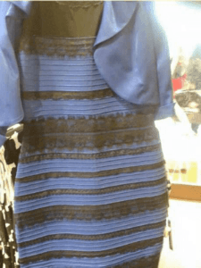
Do you remember the debate of the dress? Back in February 2015, the internet lost its collective mind when a fairly straightforward question took the world by storm. Accusations of insanity, disbelief, and Matrix-like manipulation of reality flew back and forth across the web. I’m referring, of course, to the infamous “What color is the dress?” debate. On one side, you had the blue/ black believers (the actual color of the dress was royal blue with black lace), and on the other side, the diehard “white/ gold” camp, who held the top (incorrect) spot in an informal cnn.com poll. And then you had those rare, conflicted individuals (myself included) who could see the dress as both blue/ black and white/ gold. While the matter of the dress BLUE (har har) over quickly, the incident provided a fun and maddening reminder that color, for many people, is not strictly a black and white issue.
As a print-maker, this matter of color perception takes on added importance. While we all interpret color slightly differently due to the individual rods and cones (photo receptor cells) in our eyes that determine our visual acuity, most people can recognize the major color groups even if there is considerable debate over where a particular shade falls on the color spectrum. One person may describe a school bus as “canary” yellow, another as “mustard” yellow, and a third as “don’t hit me!” yellow. In fact, when I asked my Imaging Spectrum coworkers how they would best describe the color of a school bus, I got answers from the literal “yellow with black stripes”, to “No. 2 pencil yellow”, to “reddish or orange-y yellow” and “taxi cab” yellow (as a painter, I maintain it is closest to “cadmium yellow deep” yellow). So, given the wide variety of answers to a fairly straightforward color question; what’s a print-maker to do if an image prints out different from the original source material?
For me, it’s always been the finished print that matters. Due to monitor fluctuations, paper brightness levels, ink saturation, icc profiles, and a myriad of other variables, the color on the screen is not always the best indicator of how an image will print. Proper calibration and color management can help to alleviate many issues, but until I hold a print in my hand and see the interplay of color, light, shadow, hue, and saturation, I can’t predict with 100% certainty how an image will turn out and what kind of color tweaking may need to be done to get the best results. I believe that, as a printer, your job is to provide the best possible print to your clients and customers, while remaining faithful to the image – or the idea of the image – that you are trying to reproduce. Of course, that’s just one way of looking at it.
Whatever your printmaking philosophy, there’s no doubt that today’s printers, inks and papers can play a powerful part in making sure that the image you produce is the very best possible utilizing top of the line technology. Epson’s new Ultrachrome HD inkset for the SureColor P-Series printers boasts deeper, richer blacks and an updated, more lightfast yellow as part of an advanced and lightfast ink set. So, no matter how many pictures of a school bus you may have to print, you can rest assured that the signature “cad yellow deep/ don’t hit me/ No. 2 pencil” yellow will remain fresh and vibrant for years to come.
0 Comments